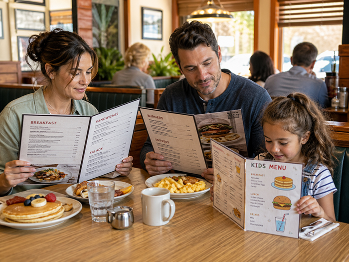
A restaurant menu is not just a list of food. It is a decision-making tool. Before a guest tastes a dish, speaks to a server, or places an order, the menu has already shaped what they notice, what they understand, what they compare, and what they feel confident choosing.
That is why good menu design is not only about looking attractive. It is about how people read, scan, absorb information, and make decisions under real-world conditions: on a phone, at a table, in a line, with friends, while hungry, distracted, or comparing prices.
At Happy Menu, we think of menu design as information design. A great menu should help customers quickly answer the questions they already have: What do you serve? What looks good? What fits my diet? What is popular? What is the price? Can I order directly? Should I come back?
The science matters because diners do not read menus the way restaurant owners often imagine they do. They scan, jump, compare, skip, return, and decide. A menu that works with that behavior feels easy. A menu that fights it feels overwhelming.
People Scan Before They Read
One of the most important lessons from usability research is that people rarely read digital content word for word. Nielsen Norman Group has found over decades of eye-tracking research that users are much more likely to scan than read every line carefully. Their scanning is not random. It is shaped by the task, layout, headings, visual hierarchy, and what the user is trying to find.
This applies directly to menus. A diner usually does not start at the first item and read every dish in order. They look for anchors. They notice headings, dish names, prices, symbols, images, badges, and familiar words. They may jump straight to burgers, pasta, vegan options, cocktails, specials, kids’ meals, or anything that sounds popular.
For restaurant owners, this means the menu must be designed for scanning first and reading second. The goal is not to force attention. The goal is to guide it.
Actionable step: make the menu scannable in 5 seconds
- Use clear category headings such as Burgers, Tacos, Pasta, Salads, Cocktails, Desserts, and Kids.
- Make dish names easy to spot before descriptions.
- Keep descriptions short enough to scan, but useful enough to sell.
- Use badges carefully: Popular, Vegan, Gluten-Free, Spicy, New, Chef’s Pick.
- Avoid burying important information in long paragraphs.
A customer should be able to glance at your menu and understand the structure almost instantly. If they have to work out how the menu is organized, the design is already creating friction.
Menus Create Cognitive Load
Cognitive load is the mental effort required to process information. The more a diner has to remember, compare, decode, or search, the harder the menu feels. This is especially important on phones, where users see less information at once and must rely more on memory as they scroll. Nielsen Norman Group notes that smaller screens can increase working-memory load because users have less surrounding context visible at any moment.
This is why a PDF menu on a phone often performs badly. A PDF may look fine on a desktop or when printed, but on mobile it can force customers to pinch, zoom, drag sideways, lose their place, and hunt for information. That is unnecessary mental effort at the exact moment when the customer is deciding whether to order, visit, call, book, or leave.
A well-structured online menu reduces cognitive load. It breaks information into clear sections. It makes categories tappable. It keeps item names, descriptions, prices, and dietary tags close together. It lets diners move through the menu without feeling lost.
Actionable step: remove unnecessary mental work
- Replace PDF-only menus with mobile-friendly online menus.
- Keep each item in a consistent format: name, description, price, tags.
- Use category navigation so customers can jump directly to what they want.
- Do not make customers decode abbreviations unless they are widely understood.
- Put dietary and allergy information next to the dish, not hidden elsewhere.
The easier the menu is to understand, the more energy the customer can spend imagining the food instead of fighting the layout.
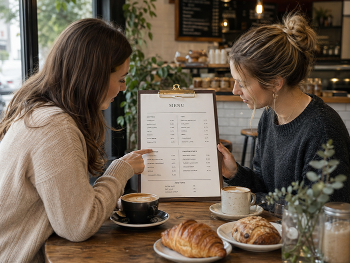
Choice Is Good, but Unstructured Choice Is Exhausting
Restaurant owners often worry that removing items will reduce sales. In reality, the bigger issue is not always the number of items. It is how those items are organized. Choice overload research is nuanced: a 2010 meta-analysis found that some studies show negative effects from too many options, while others find no effect or even positive effects depending on the context.
For menus, the practical takeaway is this: customers can handle variety when the menu helps them navigate it. A 70-item menu can feel easy if it is well grouped, searchable, and clearly labeled. A 20-item menu can feel confusing if everything is mixed together with no hierarchy.
Hick’s Law, a well-known principle in psychology, connects decision time with the number of possible choices or amount of uncertainty in a task. However, it should not be oversimplified into “fewer choices always equals better.” The smarter lesson for restaurants is to reduce uncertainty, not necessarily to slash the menu blindly.
Actionable step: organize choice instead of dumping choice
- Group dishes into logical sections.
- Highlight a few high-confidence choices in each section.
- Add “popular” or “recommended” signals where appropriate.
- Use filters for online menus, such as vegetarian, vegan, gluten-free, spicy, lunch, dinner, or kids.
- Create separate views for different contexts: dine-in, takeout, drinks, lunch specials, catering, or happy hour.
The aim is not to make the menu tiny. The aim is to make the next step obvious.
Visual Hierarchy Decides What Gets Noticed
Eye-tracking research on restaurant menus suggests that layout, color, and first-glance attention matter. One study found that participants tended to view the middle and upper-left parts of a menu most on first exposure, and that color could affect initial eye movements during the first few seconds.
This does not mean every restaurant should blindly place its most profitable dish in one “magic” spot. Menu psychology is often oversold with myths like “the golden triangle.” Real attention depends on format, screen size, task, culture, design, and what the customer is looking for.
The more useful principle is visual hierarchy. Bigger elements are noticed first. Strong headings help people orient themselves. White space makes items easier to compare. Color can draw attention, but too much color creates noise. Boxes and badges can help, but if everything is highlighted, nothing is highlighted.
Actionable step: decide what deserves attention
- Choose 1–3 items per section to feature, not 10.
- Use “Chef’s Pick,” “Most Popular,” or “Great for Sharing” labels selectively.
- Give featured dishes better descriptions, better photos, or slightly stronger placement.
- Leave enough white space around premium or signature items.
- Do not overuse red boxes, stars, icons, or bold text.
A good menu does not shout at the customer. It calmly tells the customer where to look next.
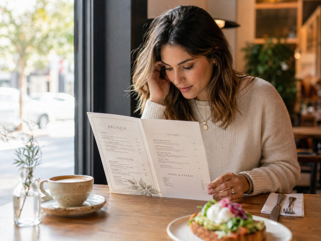
Descriptions Shape Expectations Before the Food Arrives
Dish descriptions do more than explain ingredients. They create expectations. A plain item name tells the customer what something is. A good description helps the customer imagine taste, texture, freshness, origin, preparation, and value.
Research on descriptive menu labels has found that descriptive labels may improve sales and post-consumption attitudes when used appropriately. Importantly, the same research warns that the food must live up to the expectation created by the description. Overpromising can backfire.
That is the difference between persuasion and hype. “House-made beef lasagna with slow-cooked tomato sauce, ricotta, mozzarella, and fresh basil” helps the customer understand the dish. “World-famous life-changing lasagna” may create doubt if the claim is not credible.
Actionable step: write descriptions that sell honestly
- Mention preparation: grilled, slow-cooked, wood-fired, hand-cut, house-made.
- Mention texture: crispy, creamy, tender, charred, flaky, crunchy.
- Mention key ingredients customers care about.
- Mention origin only when it is meaningful: local honey, Texas brisket, San Marzano tomatoes.
- Keep descriptions believable and specific.
A useful formula is: main ingredient + cooking method + flavor/texture + one reason to care.
Example: “Crispy chicken sandwich with buttermilk-fried chicken, house slaw, pickles, and spicy honey mayo on a toasted brioche bun.”
That description gives the customer enough sensory information to imagine the dish without making them read a novel.
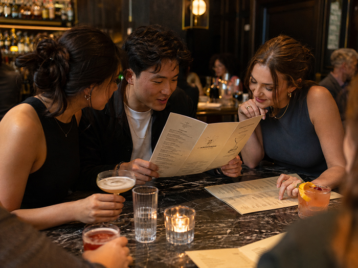
Price Presentation Changes the Way Customers Compare
Price is not just a number. It is part of the visual experience of the menu. If prices are too prominent, customers may shop the menu like a spreadsheet. If prices are hidden or confusing, customers may feel manipulated. The best menu design presents price clearly while keeping the food as the primary focus.
A Cornell study reported that diners in one upscale casual restaurant spent more when menus did not use dollar signs, compared with menus that did. The study is useful, but it should be applied carefully: price presentation is context-dependent, and customers still need clarity and trust.
For many restaurants, the practical lesson is not “hide the price.” It is “do not make price the loudest thing on the page.” Customers should first understand the value of the dish, then see the price in a clear, predictable place.
Actionable step: make prices clear but not dominant
- Keep prices close to the item they belong to.
- Avoid long dotted leader lines that encourage price scanning.
- Do not make prices larger, bolder, or visually stronger than dish names.
- For full-service restaurants, consider simple price formatting such as 18 instead of $18.00 if it fits your brand.
- For takeout, quick-service, and online ordering, prioritize clarity because customers may be comparing quickly.
The menu should make the dish feel valuable before the customer evaluates the number.
Mobile Menus Need Different Design Rules
A printed menu, a digital menu board, and a phone menu are not the same experience. On mobile, space is limited. Customers scroll. They tap with thumbs. They may be outside, in poor lighting, using one hand, or deciding quickly.
Accessibility standards give practical guidance that also improves usability. WCAG 2.2 includes text spacing guidance such as line height of at least 1.5 times the font size, and it also includes minimum target-size guidance for interactive elements, including 24 by 24 CSS pixels for many pointer targets.
For restaurant menus, this matters because a tiny “order” button, cramped category tabs, low-contrast text, or overly dense item descriptions can cost customers. Good accessibility is good hospitality.
Actionable step: design for thumbs, eyes, and real customers
- Use readable font sizes on mobile.
- Keep category buttons large enough to tap comfortably.
- Use strong contrast between text and background.
- Avoid putting important menu text inside images.
- Make the menu easy to use without pinching or zooming.
- Keep “order,” “call,” “directions,” and “reserve” actions visible where relevant.
A mobile menu should feel like it was built for a phone, not squeezed onto one.
The Best Menus Add a Decision Layer
Most menus answer the basic question: “What do we sell?” Better menus answer a more useful question: “What should I choose?”
This is where menu psychology becomes practical. Diners are not only reading information. They are making a decision. They may be asking themselves:
- What is popular here?
- What is safe if I have dietary needs?
- What is good for sharing?
- What is quick?
- What is premium?
- What is good for kids?
- What is the best value?
- What should I try if I have never been here before?
A decision layer helps answer those questions without making the customer work too hard. This could include badges, filters, recommended items, “best for” labels, dietary tags, item photos, review themes, or popular pairings.
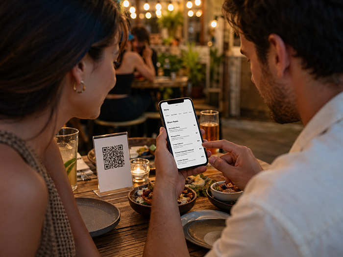
Happy Menu is built around this idea. A menu should not be trapped inside a static PDF. It should become structured data that can power your online menu, QR menu, print menu, digital menu board, search visibility, direct ordering, and customer retention tools.
Actionable step: help customers choose, not just browse
- Add “Popular” to items that genuinely sell well.
- Add “Great for Sharing” to platters, appetizers, and large-format dishes.
- Add “Quick Bite” to fast lunch items.
- Add dietary tags customers actively search for.
- Add photos only when they are high-quality and accurate.
- Use short notes like “Pairs well with…” for drinks, sides, or desserts.
The more confidently customers can choose, the more useful the menu becomes.
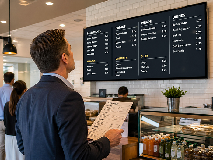
Print Menus, QR Menus, Online Menus, and Menu Boards Should Work Together
Restaurant owners often treat each menu format as a separate project. The printed menu is one file. The website menu is another. The QR code links to a PDF. The digital board is recreated manually. Specials are updated in one place but forgotten somewhere else.
This creates inconsistency. Customers see outdated prices. Staff answer the same questions repeatedly. Owners lose time updating the same information across different channels.
A modern menu system should use one structured menu as the source of truth. From that menu, a restaurant should be able to create:
- A mobile-friendly online menu
- QR code menus for tables
- Printable PDF menus
- Digital menu boards for screens
- Direct ordering menus
- Search-friendly restaurant pages
- Customer loyalty and SMS marketing campaigns
This is where Happy Menu helps restaurant owners think beyond “menu design” as a one-time graphic design task. The menu becomes a living sales asset that can be updated, displayed, printed, scanned, searched, and used to bring customers back.
A Practical Menu Psychology Checklist for Restaurant Owners
Use this checklist to review your current menu.
1. Can customers understand the menu structure immediately?
Your categories should be obvious. If customers have to search for the lunch menu, drinks, kids’ meals, or desserts, the layout is making them work too hard.
2. Are your best items easy to notice?
Do not give every item equal visual weight. Your signature dishes, high-margin items, popular sellers, and customer favorites deserve better placement and clearer descriptions.
3. Are descriptions specific and honest?
Replace vague descriptions with sensory, useful details. Avoid hype that the kitchen cannot deliver.
4. Is the mobile menu easy to use?
Open your menu on your own phone. Try using it with one hand. Try finding a vegan option, a popular dish, the price of a burger, and the order button. If that feels annoying, customers feel it too.
5. Are prices clear without dominating the page?
Customers need price clarity, but the food should be the star. If the first thing people see is a column of prices, the menu may be encouraging price comparison over appetite.
6. Are dietary needs easy to identify?
Vegetarian, vegan, gluten-free, dairy-free, nut-free, spicy, and halal indicators should be consistent and easy to understand. This is not just a design feature. For many customers, it determines whether they can order at all.
7. Is the menu consistent everywhere?
Your printed menu, QR menu, website menu, Google-facing menu, and digital board should not tell different stories. Menu inconsistency creates customer frustration and staff confusion.

Why Menu Psychology Matters for Sales and Customer Experience
Menu psychology is not about tricking customers. The best menu design does not manipulate people into buying things they do not want. It helps them make confident decisions faster.
That is good for the customer and good for the restaurant. Customers feel less overwhelmed. Staff answer fewer repetitive questions. Popular and profitable items get more visibility. Dietary information becomes easier to trust. Online visitors are more likely to stay, order, book, or visit.
The menu is one of the most important sales tools a restaurant has. It sits at the center of discovery, ordering, upselling, customer satisfaction, and repeat visits.
That is why Happy Menu treats menus as more than design files. We help restaurants turn menus into structured, mobile-friendly, searchable, printable, and display-ready experiences. The result is a menu that does what a great menu should do: help customers understand, choose, order, and come back.
FAQ
What is menu psychology?
Menu psychology is the study and practice of designing menus around how customers read, scan, compare, and choose. It includes layout, descriptions, pricing, visual hierarchy, category structure, dietary labels, and the way information is presented on print, mobile, QR codes, and digital menu boards.
Do customers really read the whole menu?
Usually, no. Most customers scan first. They look for headings, familiar categories, prices, popular items, dietary tags, images, and anything that helps them decide quickly. That is why menus should be designed for scanning before detailed reading.
How many items should a restaurant menu have?
There is no single perfect number. A small menu can be confusing if it is poorly organized, and a large menu can work well if it is clearly grouped and easy to navigate. The key is to reduce uncertainty by using strong categories, featured items, filters, and clear descriptions.
Should restaurants use photos on menus?
Photos can help when they are high-quality, accurate, and used selectively. Poor photos can reduce trust and make food look less appealing. For many restaurants, it is better to use a few excellent photos for signature dishes than to photograph every item badly.
Are PDF menus bad?
PDF menus can work for printing, but they are often frustrating on phones. Customers may need to pinch, zoom, scroll sideways, or search manually. A mobile-friendly online menu is usually better for QR codes, search visibility, ordering, accessibility, and quick updates.
Should restaurants remove dollar signs from menu prices?
It depends on the restaurant. Some research suggests that removing currency symbols may reduce price salience in certain full-service settings, but clarity still matters. Quick-service, takeout, and online ordering menus often benefit from very clear pricing. The safest rule is to make prices easy to find but not visually louder than the food.
What is the biggest menu design mistake?
The biggest mistake is treating the menu as a static design file instead of a customer decision tool. A menu should be easy to scan, easy to update, easy to use on mobile, and consistent across print, QR codes, online ordering, and digital menu boards.
How does Happy Menu help with menu design?
Happy Menu helps restaurants create structured menus that can power online menus, QR code menus, printable PDFs, digital menu boards, direct ordering, and customer loyalty tools. Instead of managing disconnected menu files, restaurants can use one menu system designed around how customers actually read and choose.